Typography Supply
January 11, 2016An inventory of typographic tools.
Some nice tools for Typography on the Web.
An inventory of typographic tools.
Some nice tools for Typography on the Web.
Google announced a new logo yesterday. I can only vaguely imagine how big of a task it is to redesign the logo for a company like Google. While there are many that “dislike” it, i think it works quite well. It’s definitely much more modern, but the tilted e at the end still preserve some of the “goofy-ness” from the old logo and the animations with those jumping dots do feel playful and match the overall style.
A very detailed redesign concept for the NYTimes from russian designer Artem Troinoi.
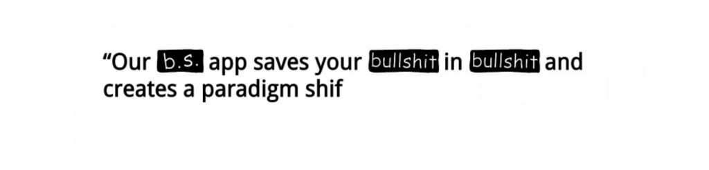
Love this.
Awesome lettering skills.
Check out this massive collection of Type Specimens. Bookmarked for some inspiration.
A directory on all things typography.
Such a beautiful craft.
An interesting read of the history of Helvetica, how it was developed and became one of the most used typefaces of the twentieth century. Starting in the 1830s with the first sans-serif’s all the way to 2013 when Apple introduced Helvetica Neue Ultralight as the default System Font in iOS 7.